23 & Me & Mr. Chimp
/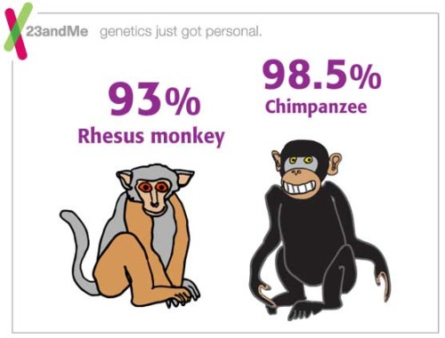
Like my daughters, like my mom--even like you!--I share a vast amount of DNA with the chimps, apes, and bananas. The consumer genetics testing company 23 & Me has a great Flash animation introduction to genetics.
Like my daughters, like my mom--even like you!--I share a vast amount of DNA with the chimps, apes, and bananas. The consumer genetics testing company 23 & Me has a great Flash animation introduction to genetics.
From Flowingdata.com:

You know all those infographics that you like so much fromGOOD Magazine? Well they're all in one place now in their Flickr archive. Head on over to view all 80.

How the Bloomberg Administration's push for design is changing the face of New York. A Conversation with First Deputy Mayor Patricia E. Harris.
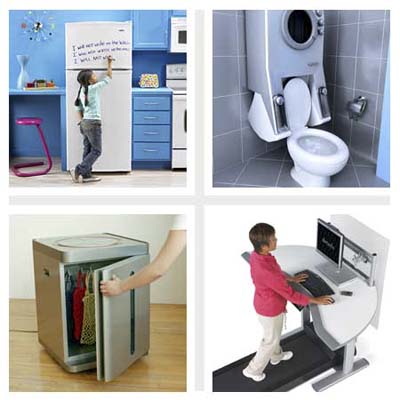 ABOVE: "Wacky Hybrid Appliances" from This Old House On-Line
My family used to have a gag gift that would show up every Christmas in someone's gift pile. The "Boob Bath Mat" never failed to shock and awe.
Each year, it seemed as if the victim never saw it coming.
Lots of time and energy goes into products that never see the light of a showroom floor. So, how did this monstrous mash-up product ever make it to the marketplace?
Someone--a team of someones, in fact--had to propose the idea, design it, send the specs to a factory in China, produce a catalog layout, write sales copy, coordinate the shipping, etc.
Since innovation is being touted as our only way out of the eco-financial desert of Western Civ, we had better get smart about finding, designing and deploying good ideas.
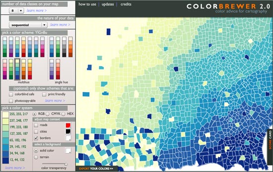 © Cynthia Brewer, Mark Harrower and The Pennsylvania State University. www.axismaps.com
When building maps and information graphics, choosing the right colors to help designate variables--whether population, temperature, or campaign dollars--is a time-consuming challenge.
How does one choose colors that are effective in communicating data, that can be read by the colorblind, that can be considered print fiendly and/or "photocopy-able" ?
The folks at Penn State have built Colorbrewer 2.0, an effective tool to swiftly aid in the process.
Once a palette is chosen, this free on-line tool allows for easy export to ArcGIS (a mapping app), Excel, or any Adobe product. You can also simply copy and paste the RGB, CMYK or HEX values.

From Pop!Tech Blog:
 The Theory: Given enough time, a hypothetical chimpanzee typing at random would, as part of its output, almost surely produce one of Shakespeare's plays (or any other text).lya Kreymerman and Nina Zito, creators of One Million Monkeys Typing, think so, too. On their new community story-telling site, members collaborate on writing a story (perhaps even a novel), without the pressure or obligation of ever completing the story by themselves.
Founded on the simple premise “read, write, publish”, the project encourages members to create new segments for “story trees”. Before beginning a new story, you must first contribute to a few existing stories. Once you’ve become part of the writing community, you receive permission (or in One Million Monkey terms, a “seed”) to start your own story tree.
The idea of one million monkeys typing is derived from the infinite monkey theorem. Community members are considered “monkeys,” with a designated number indicating the order in which they joined the site.

(via Twine)
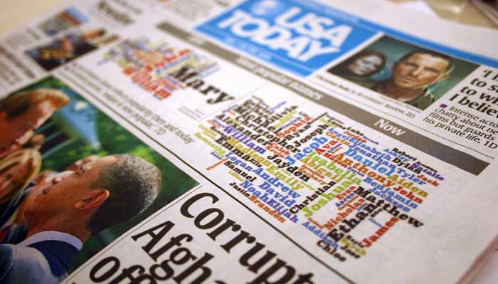 A century of most popular baby names - top 50 by decade
Yesterday's post commented on Fast Company's recognition of the importance of visualization skills. In their commentary, FC posted screenshots and video of word-images created with Wordle.
These Rorchschach-like wordmaps are fun, easy and effective to create with this (free) java-based web service. Many websites (including ours) now use the resulting images as navigation, sitemaps or splash screens. The Wordles give the viewer an instant impression of themes and importance ideas through font size and color.
I was blown away to see a Wordle used on the front page of USA Today as a feature article--not on the tool or on data visualization, but used as a graphic to illustrate the shifting trend in baby names!
 The Tokyo firm Information Architects created this Web Trend Map which presents the most popular Internet sites in the intelligible graphic language of a subway system.
It is great to see that Fast Company is catching the visualization religion.
This post mentions the Obama speech Wordles, Tufte's screed against PowerPoint, and blogs that cover visual complexity (including the blog, Visual Complexity.
Visualization may play a big role in wising up consumers. In the future, we're told, sensors will pick up tiny bits of info on every aspect of our lives and they will be played back to us as graphics. The smart grid, for example, will read the energy use in your home and send back understandable displays suggesting how you might save money by, say, waiting an hour to turn on your air conditioner or reducing your thermostat by two degrees. It will be up to architects to imbed this feature in the home in a way that allows us to interact more efficiently with our surroundings.
It's good to know, however, that Alphachimp Studio is on the frontier of design!
Check out more Obama visualizations not mentioned by Fast Company (bastages) at The Center for Graphic Facilitation:
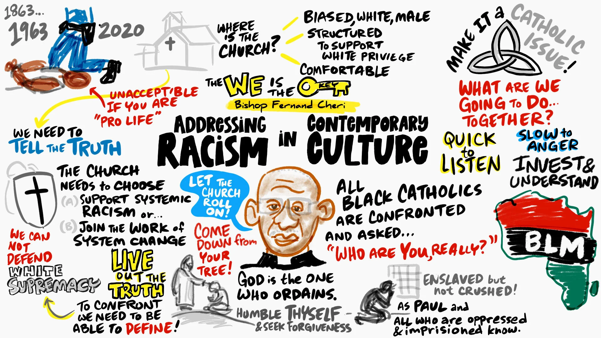
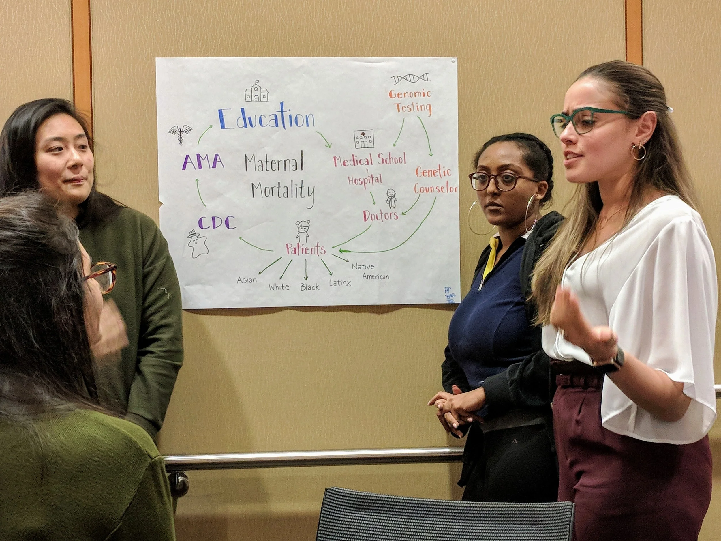
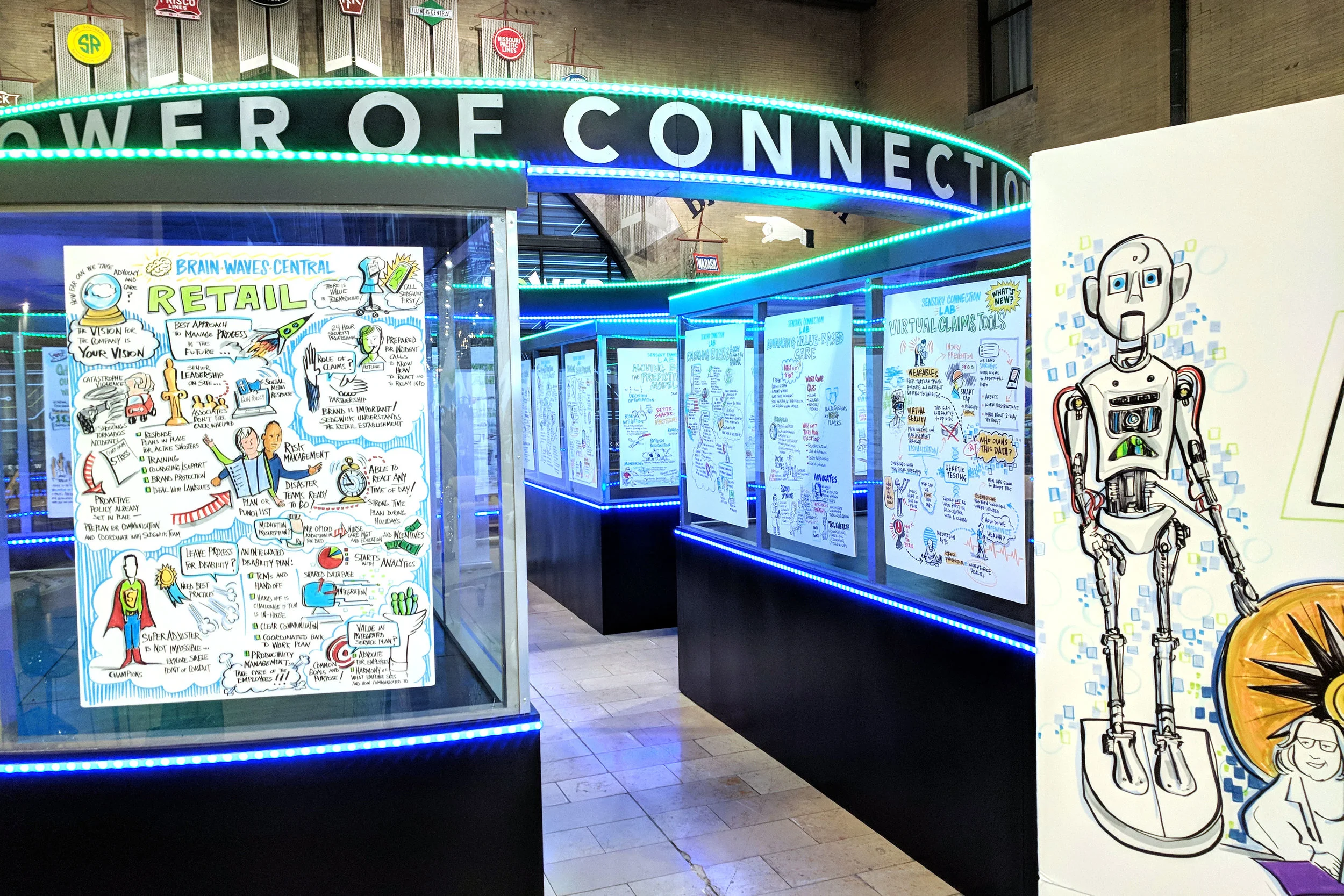
Alphachimp LLC is a visual learning company based in Houston, Texas.
Through drawings, animations, and the design-thinking process we help people understand complex situations and make better decisions.
We provide a cluster of inter-related services in the area of visual learning, graphic facilitation, problem-solving, and innovation.
COPYRIGHT © 2022 ALPHACHIMP, LLC
ALPHACHIMP® and ROCKSTAR SCRIBE® and DOODLES IN MOTION® are registered in the U.S. Patent and Trademark Office.